
Matplotlib with a dark background
The Matplotlib package for the Python language is pretty powerful, but sometimes it can be a bit frustrating to use. Some things simply aren't intuitive or obvious and the documentation can be a bit obtuse at times.
This time, I was trying to get Matplotlib to plot in negative -- not the usual black-on-white, by white-on-black. This can be useful for websites... especially those when you want to plot data on the same page as faint aurora images. While I found changing the axis face colour pretty quickly, the borders remained stubbornly white. I did figure it out in the end, but it took a while. Here's how to do it.
This results in a plot that looks like this:
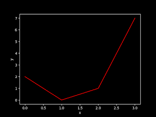
The axes face (the region within the box) and the figure face (the rest of the "page") are thus black and all the labels, etc. are set to white.
Actually, you can control all the colours of the plot, including the axes and figure face colours. To do this, you need to set the relevant rcParams. There are actually lots of these and they can be used to control most of the aspects of the way Matplotlib plots.
For example, I'll add two more lines to the previous example, which gives:
Resulting in this plot:

Important: note that the rcParam to change is "savefig.facecolor", not "figure.facecolor"!
This time, I was trying to get Matplotlib to plot in negative -- not the usual black-on-white, by white-on-black. This can be useful for websites... especially those when you want to plot data on the same page as faint aurora images. While I found changing the axis face colour pretty quickly, the borders remained stubbornly white. I did figure it out in the end, but it took a while. Here's how to do it.
#!/usr/bin/env python

import matplotlib.pyplot as plt

# Create some data
x = [0.0, 1.0, 2.0, 3.0]
y = [2.0, 0.0, 1.0, 7.0]

# Create a new figure, and set the style
fig=plt.figure()
plt.style.use('dark_background')
# Plot the data and set the labels.
plt.plot(x,y,color='r')
plt.xlabel("x")
plt.ylabel("y")

# Save the figure to a file
plt.savefig("dark.png")
This results in a plot that looks like this:

The axes face (the region within the box) and the figure face (the rest of the "page") are thus black and all the labels, etc. are set to white.
Actually, you can control all the colours of the plot, including the axes and figure face colours. To do this, you need to set the relevant rcParams. There are actually lots of these and they can be used to control most of the aspects of the way Matplotlib plots.
For example, I'll add two more lines to the previous example, which gives:
#!/usr/bin/env python
import matplotlib.pyplot as plt

# Create some data
x = [0.0, 1.0, 2.0, 3.0]
y = [2.0, 0.0, 1.0, 7.0]

# Create a new figure, and set the style
fig=plt.figure()
plt.style.use('dark_background')
plt.rcParams['axes.facecolor'] = 'g'
plt.rcParams['savefig.facecolor'] = 'b'

# Plot the data and set the labels.
plt.plot(x,y,color='r')
plt.xlabel("x")
plt.ylabel("y")

# Save the figure to a file
plt.savefig("face.png")
Resulting in this plot:

Important: note that the rcParam to change is "savefig.facecolor", not "figure.facecolor"!


Great tip. It worth mentioning that to go back to the default style sheet you may use: plt.style.use('default').
ReplyDeleteTHANKSSS
ReplyDeleteDoing animations for space physics in matplotlib is SO much nicer with black background and no axis :3 thumbs up
ReplyDeleteLearn python and earn money from python.
ReplyDeletepython course london
This blog is very knowledgeable. Thank you for writing this blog. Dreamsoft Consultancy is one of the Leading Company in India who Provide Genuine Experience Certificate in Pune. So Contact here and Get all Details. Contact Us with Get all Details- 9599119376 or check Our Website- https://experiencecertificates.com/experience-certificate-provider-in-mumbai.html
ReplyDeleteThis tutorial provides a practical way to customize Matplotlib visualizations using a dark background theme and rcParams. The step-by-step examples make it easy to understand how to modify figure styles, axis colors, and plot appearance, helping developers create visually appealing charts for dashboards, reports, and web applications.
ReplyDeleteData visualization is an essential component of data analysis, enabling users to interpret complex datasets effectively. Learning Matplotlib Training helps developers build professional charts, customize visual elements, and present analytical results clearly for scientific, business, and research applications.
Creating meaningful visualizations is also a key skill in modern analytics and machine learning workflows. Students working on Data Science Projects for Final Year can apply these visualization techniques to explore datasets, communicate insights effectively, and support data-driven decision-making through informative graphical representations.
ReplyDelete